My Role
UX Writer responsible for:
Rewriting flows to improve clarity and usability
Applying the JobPay style guide across flows
Writing CTAs, helper text, labels, and transactional messaging
Identifying usability risks and advocating for content improvements
Problem
This project was undertaken as part of the UX Content Collective UX Writing Course.
For this fictional app, these 3 sets of product flows were mapped out, but copy was incorrect and the voice was inconsistent. The ‘design team’ flagged that the experience was confusing. I needed to get the copy user-ready without redesigning the flows.
Solution
Create a new style guide with UX principles for the JobPay app
Apply the style guide to the flows, in preparation for a design review with the Head of UX and VP of Product
For this case study, I’ll focus on my process for 2. You can find 1. here (insert Style Guide hyperlink)
The flows to review were
Onboarding for both users
Flows for Freelancers
Flows for Business Owners
Constraints
The UI and designs were already set, so I could only make copy changes within the existing flows.
I also had terminology constraints; primary and secondary users were “Freelancers” and “Business Owners”.
Since this was a graded project as part of my further learning, I also had no access to user data or live usability testing. Without an opportunity to validate changes with real product metrics, I had to rely on the style guide as my ‘north star’.
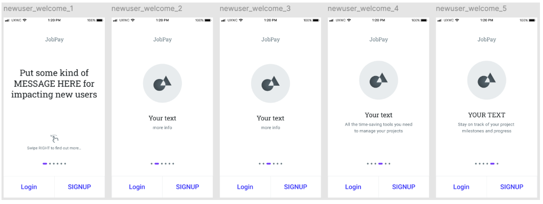
Challenge - changing tone that didn’t match the context
Onboarding screens used overly promotional language which didn’t match user intent.
Solution
I referred to the style guide. Using a verb-first content pattern, I focussed on selling JobPay’s benefits that were mutually relevant to both user types. I removed excessive adjectives, and focussed on clarity with short, direct sentences.
Old UI - flows for both user types
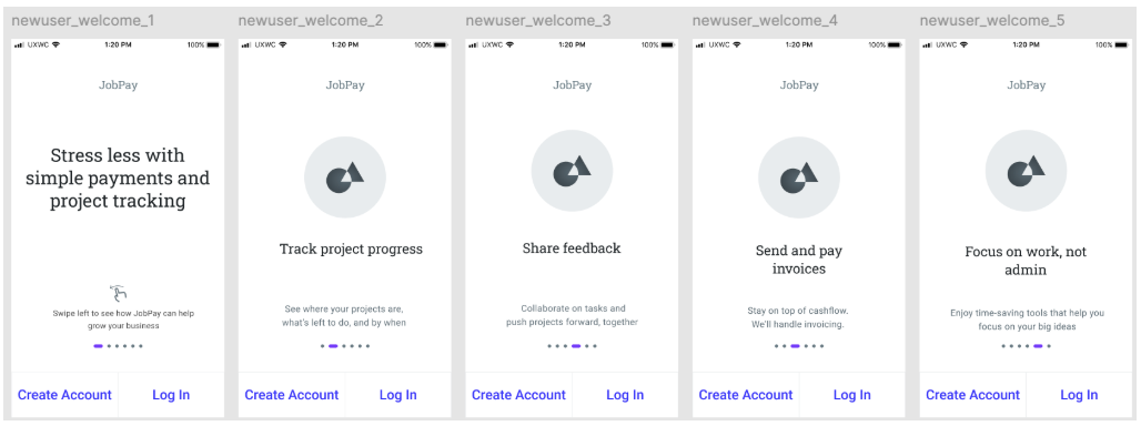
New UI - flows for both user types
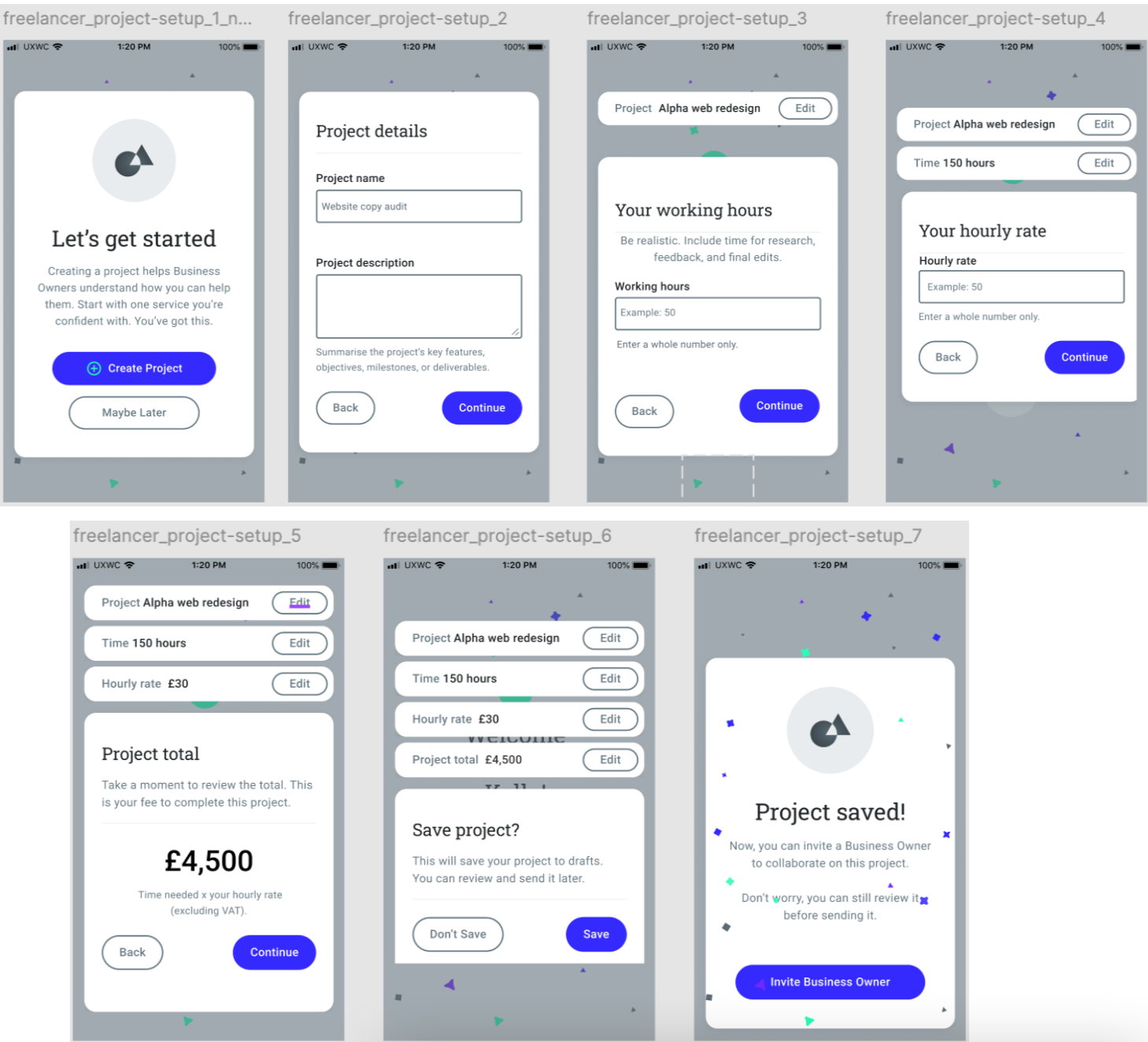
Challenge - contextualising guidelines in the UI content
A business constraint was that primary users were called Freelancers and secondary users were Business Owners. During onboarding, I identified a potential pain point when users select their profile type.
Freelancers are also technically business owners. How could we avoid ambiguity / confusion during onboarding?
How could we make it clear that Business Owners were the clients of Freelancers in this context?
In real life, we’d have been able to test different terms (Business Owners vs Clients vs Freelancers, Invoices vs Timesheets etc). But in lieu of testing I had to work within the constraints I was given.
I started making a case to introduce Clients to the platform, who would then become Business Owners once they accepted a project from a Freelancer. I discussed this with the “Product Owner” in the course, but we agreed that a sudden change in terms would increase users’ cognitive load. I could have made a strong justification for it in the style guide, but it would have conflicted with my own ‘consistency’ rules.

Solution
I kept the terms Business Owners and Freelancers throughout
I introduced supporting microcopy (tooltips, helper text) to help clarify what each role means to the user, in this context, during onboarding.

I added form labels to fields and helper text to provide guidance, context and constraints. I used sentence case for scannability.

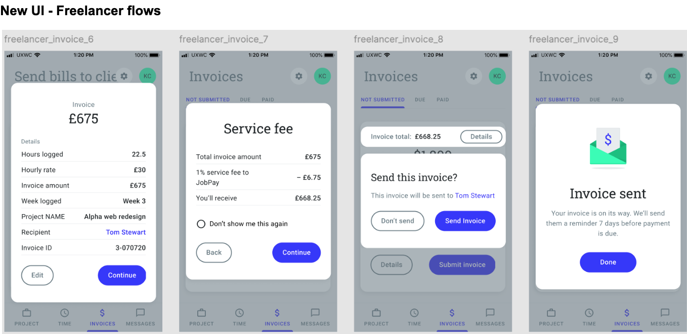
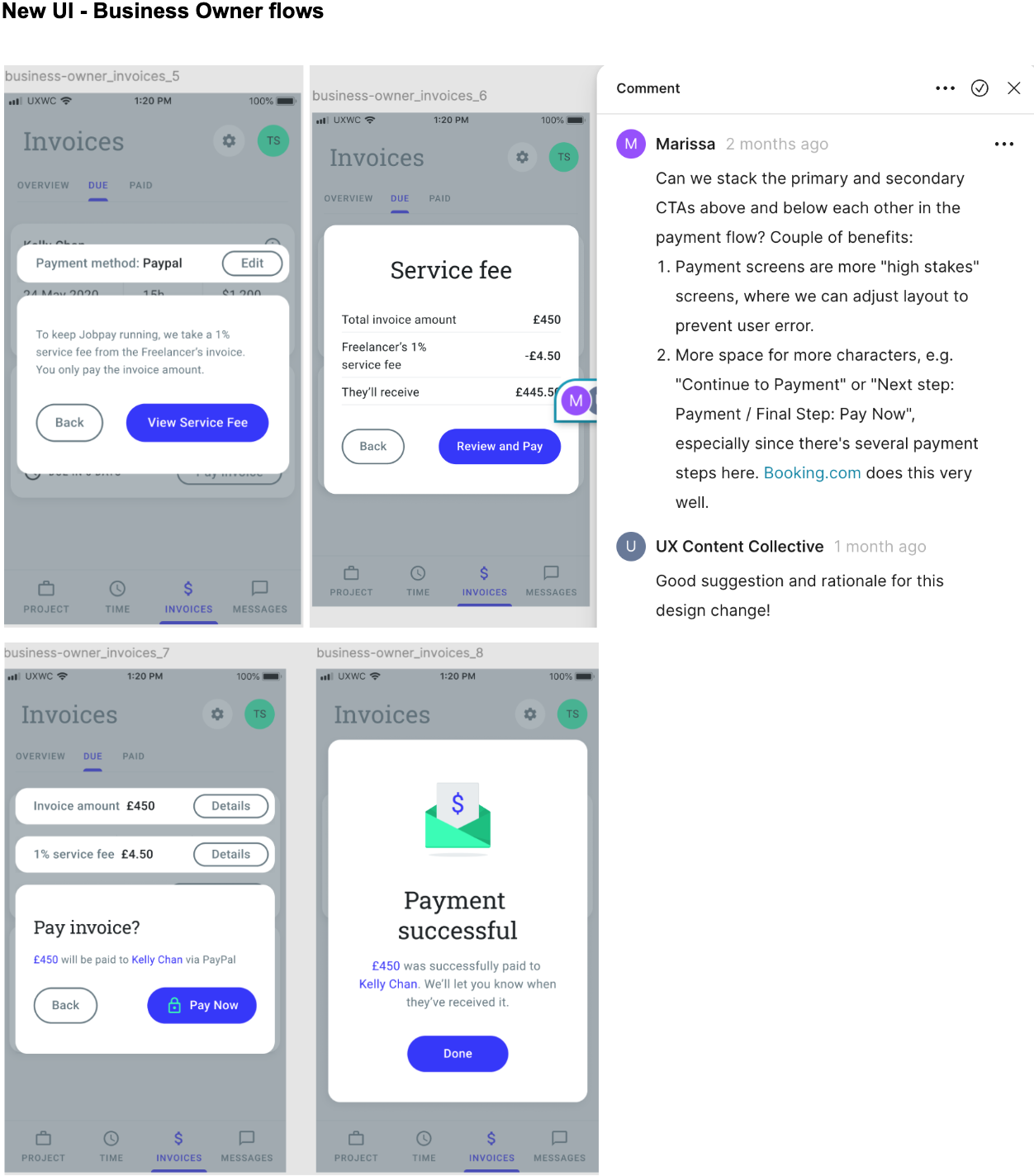
Challenge - Clarifying how payments work
The explanation of JobPay’s 1% service fee was confusing. It wasn’t clear who was responsible for this payment.
Solution
I edited these flows making it clear that Business Owners only pay the invoice total, while Freelancers cover the 1% fee for using the service. That distinction needed to feel transparent and upfront.

Content decisions
I changed vague CTAs like Continue to be more specific → Review and Pay
Simplified headings so each screen had one clear purpose
Added verb-led buttons
Flagged confusing flows in comments rather than redesigning them
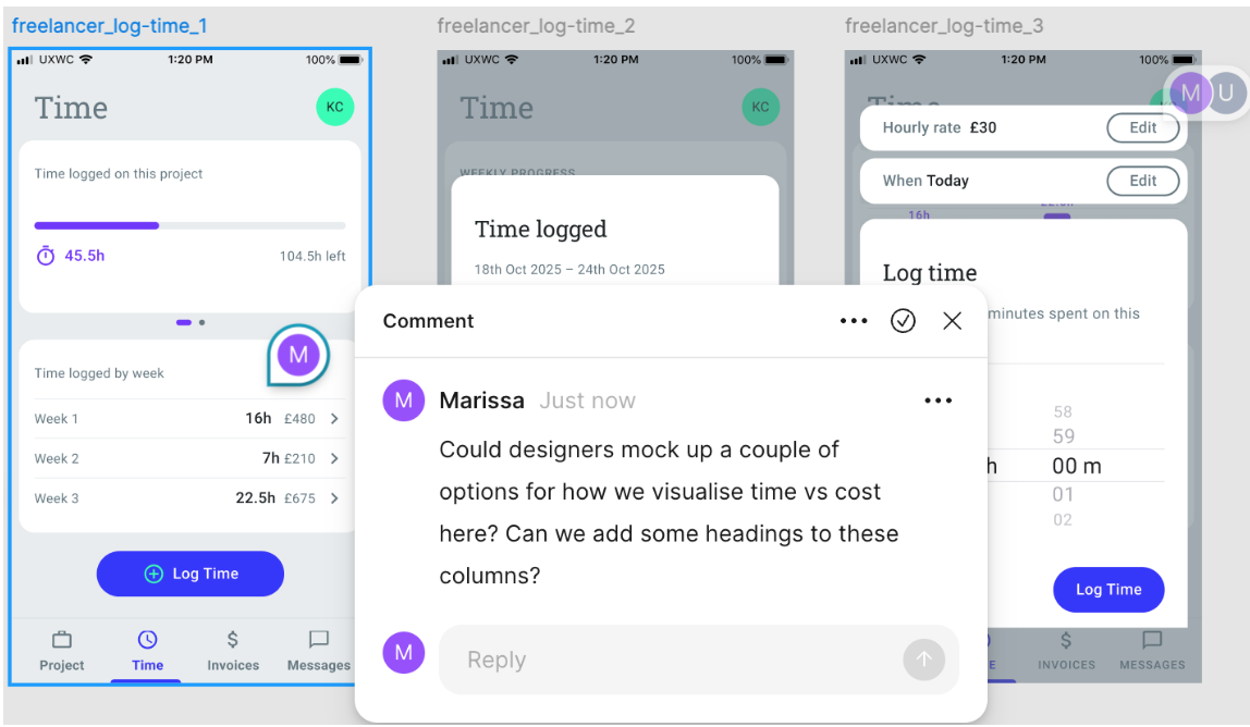
Challenge - working through ambiguity
Because this was a fictional scenario I couldn’t attend real stakeholder meetings. In real life, comments usually become larger conversations with a product team, and we’d test multiple iterations. With user profiles but no access to users, I pressure-tested flows myself:
Solution
Read screens aloud for awkward phrasing
Scanned for hierarchy and looking at what draws the eye first
Checked consistency of terminology
Ensured each screen has one primary action
Checked formatting against the style guide
It’s not formal usability testing, but it’s a strong sense-check before submission for the ‘stakeholder review’.
Results
There’s of course no live metrics, but I passed this project with an A (29/30). The updated UI now:
Reads consistently across all three user flows
Reduces ambiguity in financial flows
Removes friction in onboarding
Keeps voice consistent, trustworthy and professional
What would validate these iterations
Direct user research
Validation beyond internal teams
If implemented and validated, I would expect improvements in
Onboarding completion
Invoice payment completion rates
Reduced support queries about fees or overdue invoices
Increased user trust in financial interactions
Learnings
This project reinforced that:
A style guide is more than documentation. It’s a decision-making tool that should be updated as business needs change
Clarity is more important than personality in high-stakes flows such as payments
Small copy changes can significantly improve perceived usability
It is possible to improve UI without redesigning it
UX writing is collaborative, we think critically and ask questions rather than just writing text