My Role
UX Writer responsible for:
Defining voice & tone
Establishing UX content principles
Setting terminology standards
Problem
Onboarding flows were mapped out, but copy had inconsistent voice, confusing terminology and poor content hierarchy. The ‘design team’ flagged that the experience was confusing, and I needed to get the product user-ready without redesigning the flows.
Solution
Create a new style guide with UX principles for the JobPay app
Apply the style guide to the flows, in preparation for a design review with the Head of UX and VP of Product
For this case study, I’ll focus on my process for 1. You can find 2. here (insert UI screens hyperlink)
Process
Start with the style guide, not the screens
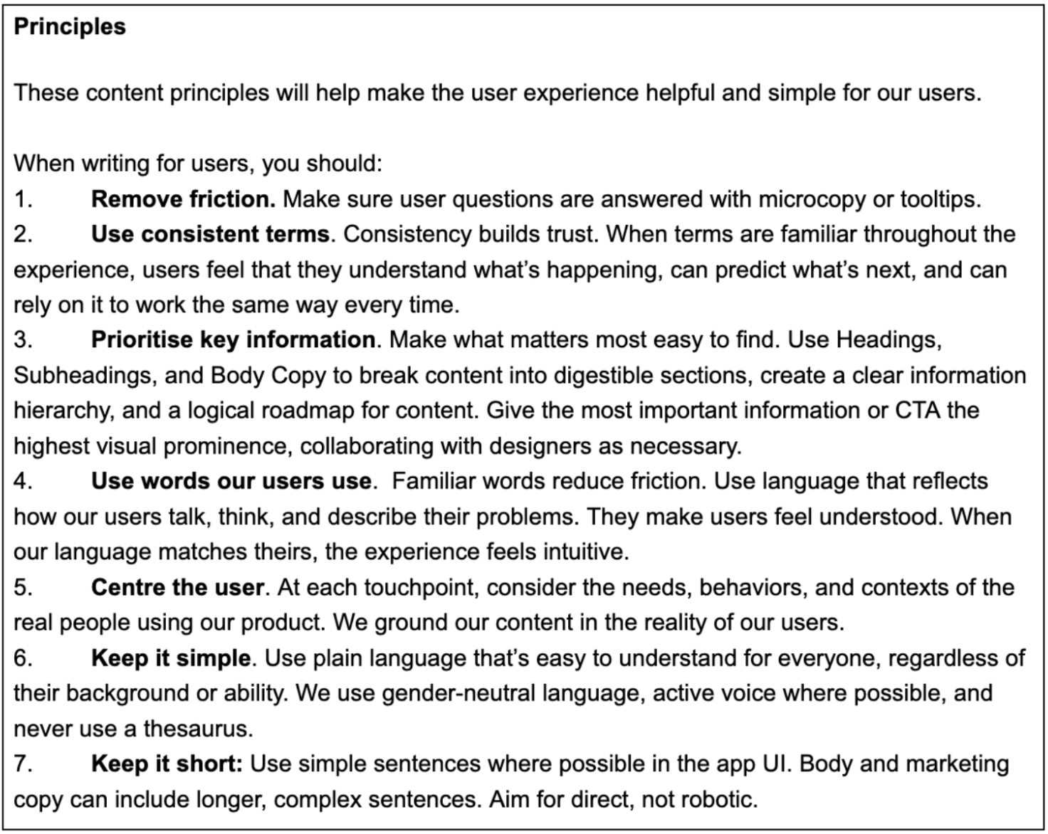
I started writing the Style Guide to set guardrails for the tone, voice, and UX principles. I could then make UX decisions consistently and intentionally.
I started with the content principles to ensure content was easy to navigate. ‘Prioritising key information’ for example, would ensure information hierarchy is clear in the UI.
Constraints
Since this was a graded project completed as part of my further learning, I had no access to users or stakeholders for validation. I developed content standards based on the available user profiles and project constraints, ensuring they could scale across multiple user types and interfaces.
Set voice characteristics and preferred terms & word choice
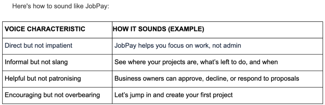
Using the Nielsen Norman Group’s (NN/g) framework of 4 core dimensions of tone of voice, I set the voice and characteristics for JobPay. This would give us a consistent voice across the experience, build user trust and allow us to resonate emotionally with users in different contexts.
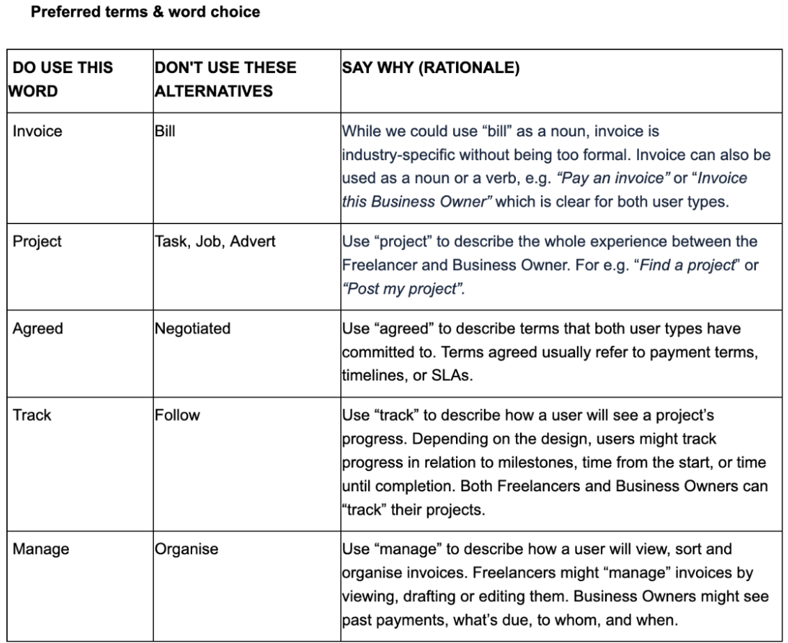
I then chose our preferred terms to ensure terminology was consistent and easy-to-understand throughout.
Setting the rules for tone
While the core "voice" remained consistent, I wanted us to adapt our tone depending on the touchpoint. This would create an intuitive experience that considered the user’s emotional state at specific moments in the journey.

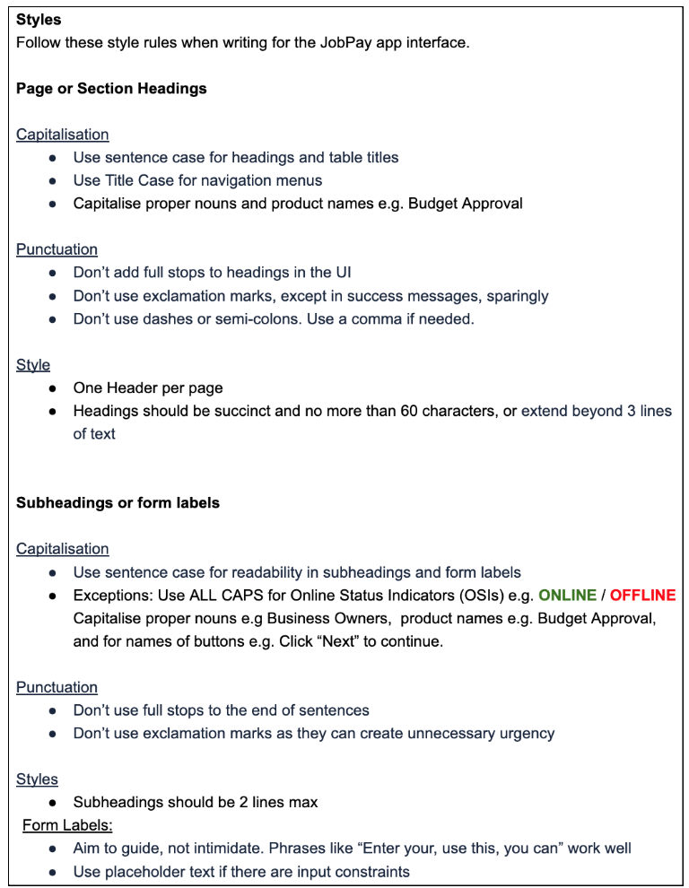
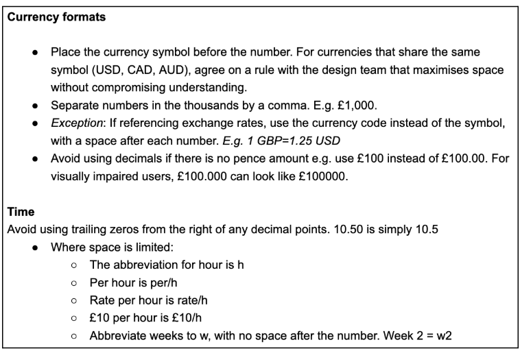
I then set the style rules for headings, body copy, forms, currency, and numbers.

Challenge - setting scalable rules
For date, I had originally decided to use ordinals for clarity. But I tested this in the UI and we couldn’t include them in mobile due to space limitations. To keep formatting consistent, I changed the rule itself.
This was a reminder that style guides are flexible frameworks not rigid laws, and UX/UI decisions must always prioritise user reality and real-world context over blind adherence to rules.
Equally, currencies share the same symbols e.g. $ (AUD) and $ (USD) and we needed to differentiate them to avoid confusion. Instead of setting a rule here, I recommended that design teams test solutions to see what works best.

Learning
Defining a brand is usually a shared effort. In a real-time scenario, I’d have started this project by interviewing stakeholders in different teams: who are we from a support / sales / social media lens? In those interviews I’d ask:
Describe our company’s personality in 3 words.
If we had an aesthetic, what would it look like?
I want our company/products to make people feel (adjective)?
I want people to (verb) when they interact with our products?
We don’t like companies that sound (adjective)
We’d like to mimic the voice of (person/brand)
How do we sound in emails vs on socials - does it change?
I would review these collectively to define our company identity and share this with senior management or the CEO for review. This is typically a consultative, iterative process, with final sign-off occurring once they approve the final draft.
This way, we capture each department’s voice to build a unified vision of who we are.